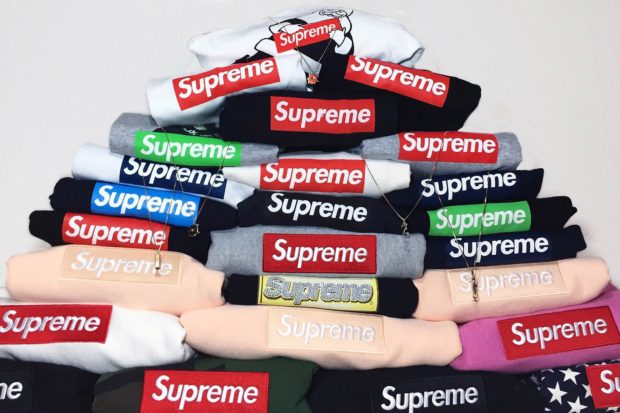
There’s no logo in streetwear (and arguably in fashion as a whole) that’s more iconic than Supreme’s signature box logo. The vaunted design, consisting of a Barbra Krueger-inspired red rectangle surrounding white Futura Bold Italic text is at once recognizable to people from all corners of the world and walks of life. Indeed, it’s reached near-mythical status alongside other infamous logos like Nike’s swoosh, Louis Vuitton’s LV monogram or the “NY” on a Yankees cap.
Since its inception in 1994, Supreme’s box logo has arrived in many different iterations, adorning many different items, from tees to hoodies to stickers. It’s been done up in a myriad of colors, used as a collaborative centerpiece by multiple brands who have worked with Supreme, and has been re-interprited by some of the most famous street artists of our time. It’s an outstanding logo with an amazing story behind each design, and has come to represent the very pinnacle of streetwear glory.
There’s so many box logos that keeping track of every one released in the brand’s 20-plus year history is borderline impossible … so we thought we’d break all the options down to the cream of the crop. Today we’re bringing you a list of the ten best box logos that Supreme has ever released. It’s not a list of the best box logo tees, hoodies, stickers, or anything else … it’s just about the actual box logo itself and the cultural relevance of each design. From classic to collaborative to under-the-radar, there’s a box logo for all types of Supreme fans among these ten, so let’s dive right in to the hyped-up madness.
Honorable Mention: Kaws
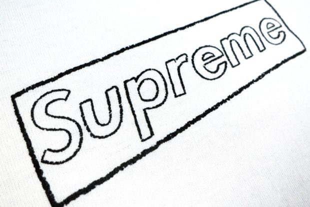
Year Introduced: 2011
Brian “KAWS” Donnelly and Supreme have a long collaborative history beginning back in 2008 when the artist worked on a now-infamous Kate Moss tee along with two highly desirable skate decks featuring his iconic “Chum” character. For their second go-around in 2011, KAWS added a hand-drawn touch to Supreme’s iconic box logo, offering a stencil outline of the rectangular border and the letters themselves for a stripped-down, rough-hewn, authentic street art look.
10. Coca-Cola
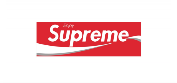
Year Introduced: 1997
Back in 1997, a mere three years after they were founded, Supreme was still small enough to get away with releasing as many parodies and logo flips as their hearts desired. One of of their earliest gems? A Coca-Cola inspired box logo. Not an official collaboration, the logo took Coke’s iconic swooping graphic and “enjoy” mantra, and molded them into their box logo in a fashion that was so seamless you’d be forgiven for mistaking it as a Coke tee at first glance. Can you imagine the lawsuits if they did a flip like this in 2018? We don’t even want to think about it.
9. Burberry
![]()
Year Introduced: 1997
Another early parody gem from Supreme, this Burberry check-inspired box logo was a fan favorite before official high fashion and streetwear collaborations were even a twinkle in Kim Jones’s eye. The box logo arrived at a perfect time, as Burberry was trying to distance themselves from this pattern in the 90’s because it had become a favorite of their unwanted “chav” audience. The disassociation from the legendary British high-fashion brand made Supreme’s take on the classic pattern doubly amusing, as it was somewhat accidentally aimed at the same cultural sect that Burberry was trying so desperately to avoid.
8. 9/11
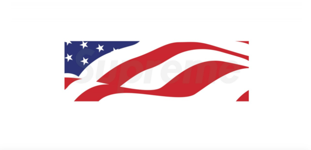
Year Introduced: 2001
As a brand that’s always been incredibly proud of their New York roots, you know Supreme had to do something special when tragedy struck their home city on September 11th, 2001. A stylized, waving, patriotic American flag box logo tee was that aforementioned “something special,” and 100% of proceeds from the design were donated towards 9/11 relief efforts.
7. The Sopranos
Year Introduced: 2005
If the box logos on this list were ranked solely on value and overall scarcity, the “Sopranos” graphic would be much closer to the top spot. The iconic television show’s logo was re-purposed to fit Supreme’s needs, with a gun replacing the “R” in Supreme, a clever nod to both the show’s original logo and theme song, “Got Yourself A Gun.” As a box logo any Supreme lover or die-hard Sopranos fan would kill to own, we’d say the gun graphic is pretty fitting.
6. Bape
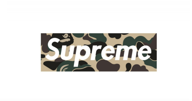
Year Introduced: 2002
When two titans of industry come together and fuse their two most iconic graphics into one design, the result is usually nothing short of spectacular. Spectacular is exactly what Supreme and Bape did when they collaborated on more than ten different colored camo box logo tees back in 2002. One of the few iconic prints in streetwear that can match the relevance of the box logo, Bape’s camo combined with Supreme’s signature typeface ignited a logo-fueled wildfire under fans of both brands, and the shirts flew off the shelves in record time. Can you imagine what would happen if this collaboration re-occured today? One word: pandemonium.
5. Damien Hirst
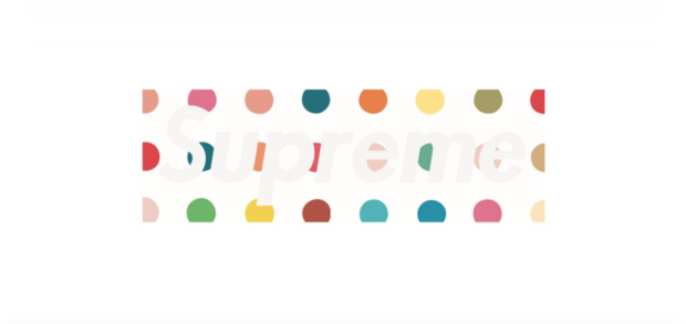
Year Introduced: 2009
English artist Damien Hirst lent his signature dotted motif to Supreme for a highly sought-after box logo tee in 2009, and later on decks adorned with “Life’s A Bitch And Then You Die” (in 2011). Offering a more playful, colorful, whimsical look than most of the other box logos on this list, Hirst’s collaboration is one of the few iconic box logos that doesn’t heavily feature a red-and-white colorway in some way, shape, or form.
4. Gucci![]()
Year Introduced: 2000
This box logo doesn’t have anything to do with Gucci Mane (who Supreme collaborated with in 2016) … it’s just good old classic Gucci. Supreme took the legendary Italian brand’s signature red and green/red and tan stripes, and applied their own font to it for yet another unique parody graphic. While other brands (that you’ll encounter shortly on this list) didn’t appreciate Supreme’s homage, Gucci was unaffected, never issuing a cease and desist to Supreme. That doesn’t affect this logo’s rarity however, as finding a sticker or tee shirt with the red stripe is both difficult and extremely expensive.
3. Fuck Bush
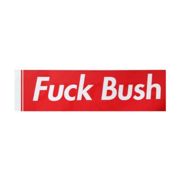
Year Introduced: 2005
Supreme gladly did what they could to support their city through hard times with their 9/11 charity box logo, but they had no love lost for sitting president George W. Bush, releasing a “Fuck Bush” sticker, (the only “box logo” on this list that doesn’t actually say “Supreme”) after the controversial president won a second term in 2005. Supreme has never shied away from making political statements, but this loud, direct graphic that replaced the brand’s name on stickers was their most powerful statement to date, and is a favorite of many a New Yorker and OG Supreme collector around the world.
2. Louis Vuitton (OG)
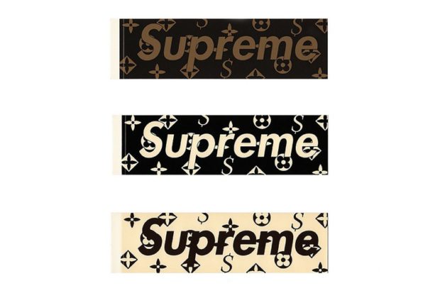
Year Introduced: 2000
Before Supreme and Louis Vuitton came together officially in 2017 for a wide-reaching collaboration that (for better or worse) changed the landscape of both streetwear and high fashion forever, Supreme cheekily appropriated Louis Vuitton’s classic monogram print, replacing the monogrammed LV’s with a hybrid S/dollar sign logo. Louis Vuitton was not amused by the parody/homage and almost instantly slapped Supreme with a cease and desist (clearly they’re not as laid-back as Gucci), forcing them to stop production and pull any products featuring the graphic off the market. A key point and design in Supreme’s history, anything adorned with the homage monogram is so rare and valuable that even the stickers sell for well over $100.
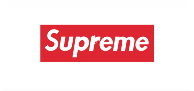
1. OG
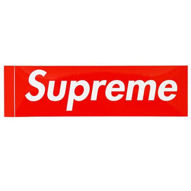
Year Introduced: 1994
Rhetorical question: could anything really take the top spot over the OG red box logo? Nothing else on the list (and likely the brand as a whole) would even exist if James Jebbia hadn’t dreamed up the Barbra Krueger-inspired graphic back in 1994. It’s simple, clean, and as we mentioned at the top of the article … it’s iconic. Love it or hate it (we’re assuming you love it if you got this far), you know about it and respect its value and what it stands for, exactly the reason why it claims the #1 spot on this list of storied designs.
What’s your favorite Supreme box logo of all time? Do you agree with our list, or would you re-arange a few things? Was a box logo you’re partial to left off? If so, which one was it? Sound off in the comments or hit us up and let us know on Twitter!
Share KicksOneTwo